We’ve decided to share this insightful piece by Ondřej Ilinčev, a CRO and UX expert, originally published here. With Ondřej’s permission for translation and republishing, we believe in the valuable lessons publishers can learn from the e-commerce sector, which this article primarily targets. Dive in and explore how these insights can assist publishers in rethinking their approach to content.
What you can find in this article:
- What a blog article should contain
- Title
- Summary
- Author, date and labels (topics)
- Audio version of the article
- Table of Contents
- Photo and gallery
- Quotation
- Product tile, button
- Author profile
- Discussion
- Sharing options
- Frequently asked questions
- Related articles
- Subscription to the newsletter
- Popularity of individual elements
- How long it should be
- The main thing is to write regularly (ahem)
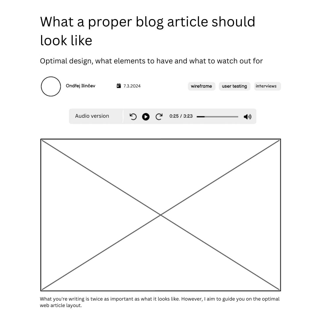
What you’re writing is twice as important as what it looks like. However, I aim to guide you on the optimal web article layout.
Andy Crestodina reviewed 101 biggest blogs and made a summary. What they have and don’t have. I am lazy efficient, so I asked Jakub Rejnuš. Then I put it all together and drew it.
What a blog article should contain
Title
“On the average, five times as many people read the headline as read the body copy. When you have written your headline, you have spent eighty cents out of your dollar.” – David Ogilvy
This might have held true in the last century. Now I’m skeptical. The headline remains important, and it’s definitely worth taking a moment to choose the right variation. Write a headline that will make your readers read on. And then you can check its effectiveness.
Summary (Perex)
You’ll be writing the summary for search engines anyway, so why not use it here too? I advocate summarizing the most important content at the top (the so-called inverted pyramid). But be careful not to make it so informative that reading the article itself will no longer be needed. 🙂 Thus, a blend of content and a promise. On the other hand, watch out for clickbait.
Author, date and labels (topics)
The vast majority of blogs list the author. Sixty-three percent of them include a photo, which I think is nice. Copyhackers also list the editor and the opponent besides the author.
The date is a bit of a delicate subject. Personally, I don’t add it to articles because they can appear outdated. And that is a mistake with content that remains relevant for a long time.
Do you have a news website? Then the date belongs there. If you have long-term content, I wouldn’t include the date.
Audio version of the article
This is quite a novelty. With the advent of artificial intelligence and language processing, there are tools available that will record your article into the Czech language in very decent quality. It’s not completely perfect; sometimes, there’s a too long pause, but it serves its purpose.
Here is an example from DenníkN:
Jakub found the ElevenLabs and PlayHT tools useful. Well, then there is a higher level – HeyGen, which can include a video and translation into another language. Eliška Vyhnánková demonstrates it on Linkedin, and it made my jaw drop.
Table of Contents
I see it almost everywhere now. I suppose it’s mainly because of SEO. But it’s also fine from the user’s perspective. At least it forces you to make a proper structure of the headings and the article itself 🙂. Here is an example from CXL:
Photo and gallery
Photos charmingly divide your content and add dynamics. I want to see at least one photo on each screen, ideally with a description and proper alt text. It doesn’t matter to me if it’s a gallery, a full-width photo, or a photo wrapped by text.
Quotation
A great graphic element that kills two birds with one stone:
- 1st bird – it increases authority and dynamics
- 2nd bird – it improves SEO
Ideally, it has a different background, is in italics, with a photo, name, and a job title of the author.
Product tile, button
Here I see the primary problem with most existing solutions. Content Management Systems cant work with ecommerce web content. But the main reason for writing articles on an eshop is to attract visitors and turn them into customers.
So, as part of the article, I want to have the possibility to add:
- a category label (topic),
- a product tile or multiple product tiles,
- a button (to add to cart).
Author profile
It’s nice to have an author profile under each article. It doesn’t have to be a complete biography, but rather a short text that humanizes the author. I write about my Bulgarian grandfather in mine.
Discussion
In my opinion, it’s a bit of a double-edged sword.
- At its best, it’s an opportunity to create a community.
- At its worst, it’s a magnet for trolls, spam, and negative social proof with zero comments.
Sharing options
The question is not if, but rather where. Roughly the same number of blogs have sharing options:
- 36% above the headline (55% of people share an article without even finishing reading it),
- 35% along the side,
- 33% at the end of the article, and
- 22% have none at all.
(For those paying closer attention – some blogs have sharing options in more than one place, so the total is not 100%.)
Frequently asked questions
Great for SEO (you can appear in rich snippets), nice for users. But don’t force yourself to pull the questions out of thin air. Ask friends, Google, or ChatGPT.
Related articles
Again, an absolute necessity. But it’s nice to keep an eye on the algorithm according to which the articles are selected. Ideally, it would be by category, tags, and the content of the article itself. The reality, at least for me, is closer to random selection 🙂.
Subscription to the newsletter
Absolute priority – because most people are not willing to buy at the very moment. However, they will be more willing to subscribe to the newsletter if the articles are:
- interesting,
- useful and/or
- funny.
I’ve tried different variants, from the floating bar to the form below the article. The exit popup works best for me.
Popularity of individual elements of the article
| Related articles | 79 % |
| Share buttons | 78 % |
| Search tool | 73 % |
| Date of publication | 71 % |
| Subscription to the newsletter | 67 % |
| Author picture | 63 % |
| Comments | 51 % |
| One column (no sidebar) | 44 % |
| Reading time | 14 % |
How long should it be?
An SEO specialist might say between 1,500 and 3,000 words. I say: long enough to convey information to the user, including the context. Personally, I rarely write less than 1,000 words. But Seth Godin, for example, writes shorter articles. Nevertheless, he has been writing every day for more than 10 years.
The main thing is to write regularly (ahem)
I used to write every week for years, and I still enjoy it. I guess I just got lazy or fell out of routine.
Anyway, the minimum frequency is at least once every two weeks. Otherwise, people won’t remember you much, and at the same time, it will still hurt you. It’s like going to the gym. If you’re not there at least twice a week, it’s painful every time.
Resources
https://www.orbitmedia.com/blog/how-to-design-a-blog/
https://unbounce.com/landing-pages/copy-design-more-important-landing-page-success/
O čem psát
Jak napsat skvělý článek za 3 hodiny
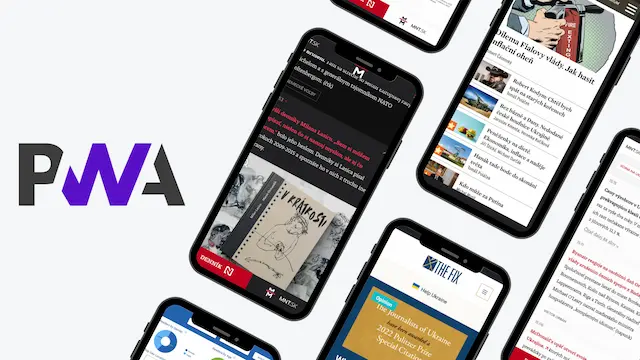
The original article includes a downloadable template for creating an ideal blog post, designed for both website and mobile platforms. Please be aware that this template is exclusively available in Czech.
Related articles
Enjoyed the post? Share it.
A digital news strategist interested in growing direct revenue, AI and newsroom innovation.


